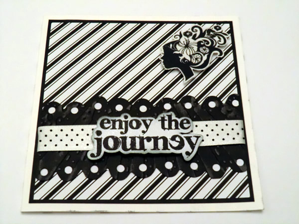
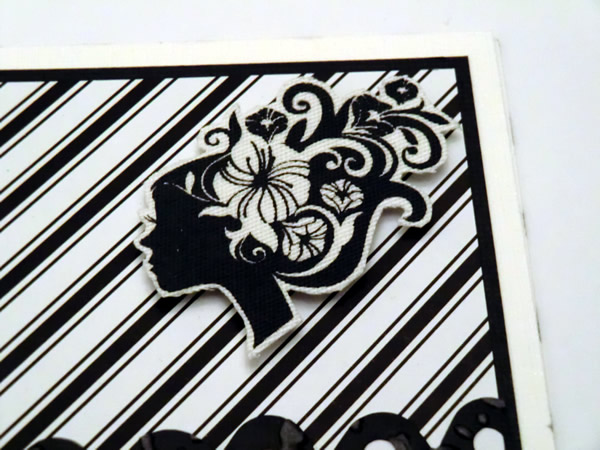
Last Thursday, Lein and me were crafting at my place and when she asked me why I hadn't used my logo for the challenge Simon Says Stamp and Show: some women only!? Well I could not answer that, except that I just hadn't thought of it. That's a bit strange because in my craftroom is full with it. So I decided to join in again. This time I chose a black (very dark gray) / white theme. And I used my new edge die and embossing folder from Tim Holtz. Behind the holes of the die cut, I put bits of white paper, so the border will stand out better against the background.
Here is the result:


The materials
- Distress Ink: ice spruce
- Archival Ink: Jet Black
- Die: Tim Holtz
- Embossing folder: Tim Holtz
- Stamp: Tim Holtz
- Ribbon
- Perfect pearls missing: Perfect Pearl
- Logo: screen-printed on fabric with acrylic paint and textile medium
Thanks so much for stopping by!
Sandra


3 comments:
Mooie kaart zeg!
Groet Patricia
Lovely card, love the monochromatic. Thanks so much for joining in the Simon Says Stamp and Show Challenge. Tracy x
WOW deze is echt heeeeeeel gaaaaaf geworden San! Love it!!!
Liefs,
Leintje*
Post a Comment